Let’s talk trends.
I know it can be tempting to join in on trends when building your brand but please, let me teach you how to do it the right way. I promise it’s worth it!
First things first, I highly recommend avoiding trends when working with your logo and colors. Trends are just that. Trends. They come and go so quickly. Building your brand off of trends is not sustainable and forces you into updating your branding yearly, when things start to look and feel stale. Why create more work for yourself if you don’t have to?
With that, let’s get into my list of don’ts!
Don’t Build Your Brand Around A Trendy Aesthetic
Lets take a stroll down memory lane. Marble and gold, watercolor and floral wreaths are all trendy aesthetics that have come and gone in the past decade. None of these trends were sustainable, even though they were seen everywhere. It’s best to avoid building your brand around these trendy aesthetics, as it just creates more work down the road when you will inevitably have to update your branding because the trend will no longer be seen as trendy. Just because you’re all into a trend now, doesn’t mean you’ll still be into next year.
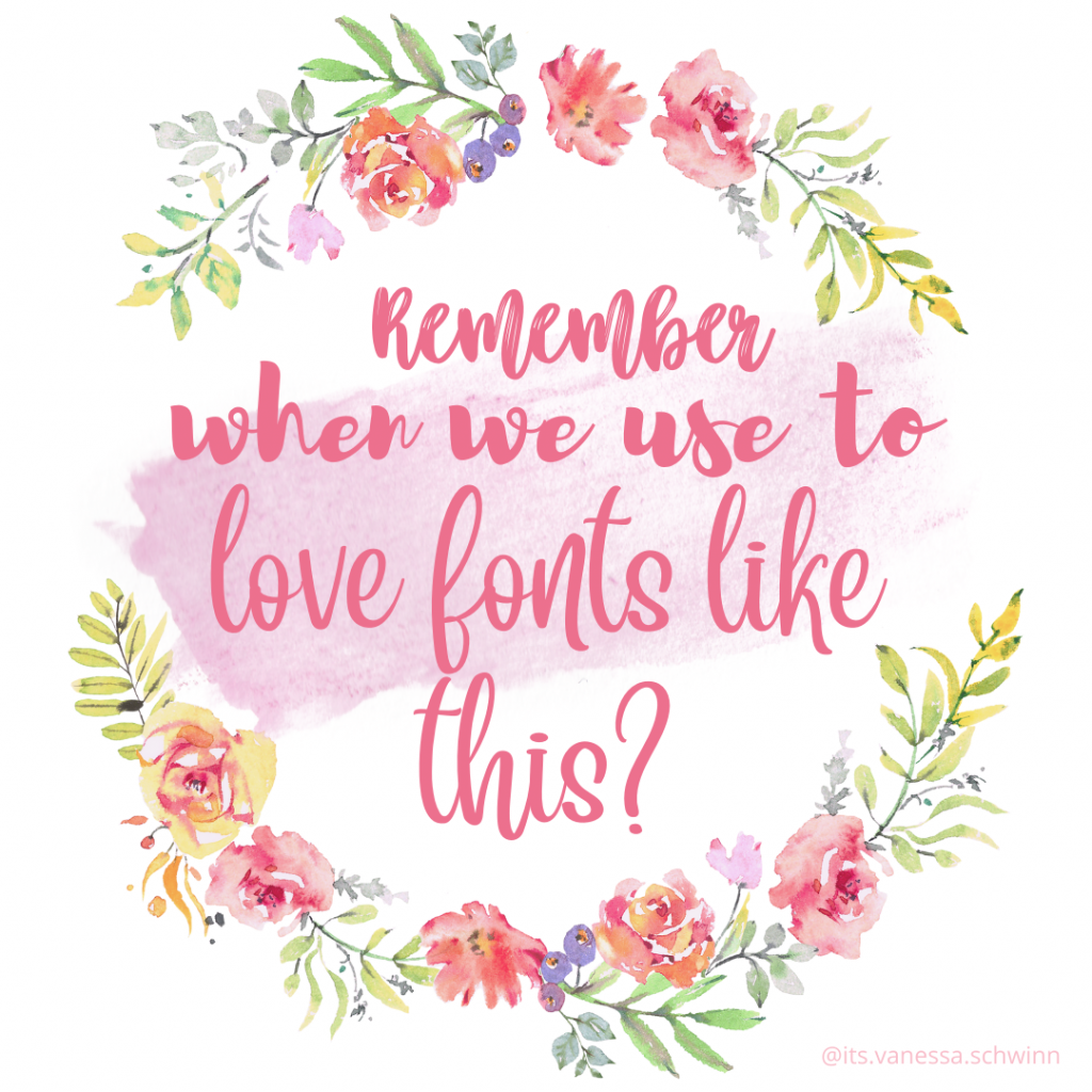
- Avoid Choosing Script For Your Main Fonts
- These come and go every year. In my opinion, it’s best to steer clear of script fonts, as they can date your brand. You would have to constantly be updating these fonts, which creates unnecessary work for yourself. Why not choose something that will withstand the test of time? Think of all the billion dollar companies who are instantly recognizable due to their use of serif or sans serif fonts. Chanel, Nike, Apple, Target, Starbucks – successful brands do not use script fonts.
Avoid Trendy Color Palettes
There’s so many color combinations that don’t actually work well together, or are dated. Again, it’s best to avoid trendy color palettes that you’ll have to continuously update to stay current. Find classic color combinations instead for the foundation of your brand and incorporate pops of color throughout. (I talk more in a bit!)
If you need any examples of this do a little google search of years past trendy wedding colors. You’ll see exactly what I mean!
Now, this doesn’t mean you have to avoid trends all together. They can actually be a fun way to spruce up your brand without completely rebranding every time your style evolves! This allows the foundation of your brand to remain consistent, and that is how to achieve brand recognition! When you’re caught up in trends and blending in with everyone else, you lack character and are easily forgettable. It’s harsh, but true.
Just remember we want the trends to be a fun addition to your brand, not the core of it!
Here is my list of do’s when incorporating trends into your brand.
Do Incorporate trendy design elements
Fun shapes and textures can easily be added into your visuals. To ensure they blend seamlessly into your visuals, make sure you edit them to match your brand colors. (Further explained in the following points!)
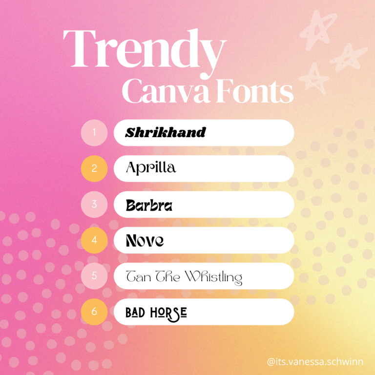
Do Use a trendy font as an accent
If you’re wanting to incorporate a trendy font, keep it to a smaller scale. I’m begging you, don’t change your body copy to a trendy font. If nothing else, it makes your text hard to read, which is the opposite of what you want when building a stand out brand! Fight the urge to have this trendy font take over your brand. A trendy font should be a fun addition to what you already have – use it sparingly.
Do Incorporate trendy colors
You can absolutely add a pop of color (or two!) in your branding. But again, keep it as an accent, not your main color choice for your website or social media posts. You don’t want your brand to look overwhelming or messy.
Do Use Canva Templates To Enhance Your Visuals.
This allows you to still join in with trends, but make them work for you. If you don’t already have brand colors and fonts*, please get on that! It’s a huge time saver when you create for your business, or when outsourcing to someone!
Dedicated brand colors and fonts are something you have readily available when creating for your brand. This means that every time you go to create online visual marketing for your brand, you pull from this list of fonts and colors so that everything remains consistent and recognizable. This list can also include accent fonts and colors for when you want to add trends to your marketing!
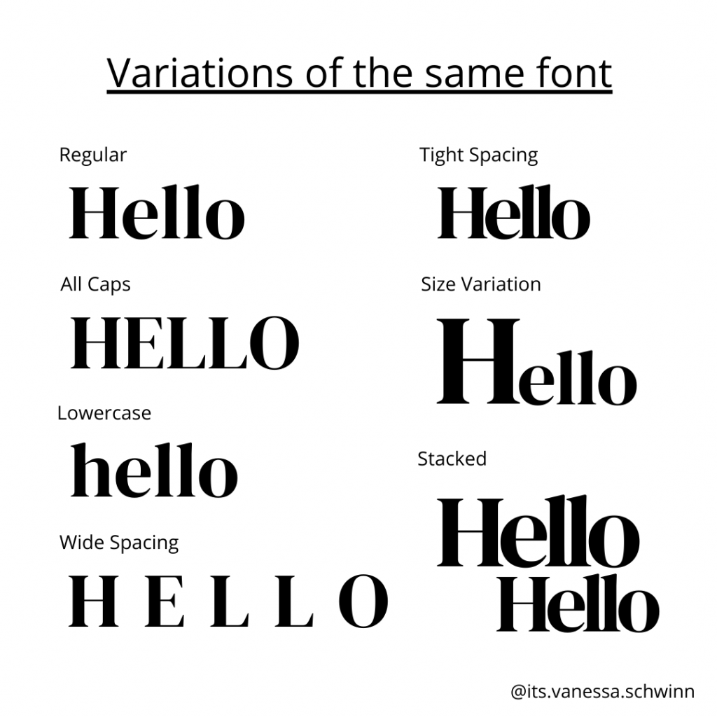
Do Make Adjustments To Your Main Fonts.
This is a super simple way to change the look of your body copy without sacrificing the integrity of your brand. Play around with this when creating website copy and social media posts! It keeps the look of your brand interesting, while remaining consistent and cohesive.
And please, before using a trend, see if it’s something you actually like. Don’t join in on a trend just for the sake of joining in. Make sure you can easily incorporate it into the foundation of your branding.
Your brand should always feel like a refection of who you are. So when you’re making the choice to incorporate a trend you MUST make that decision on how it’ll make you and your audience feel. If it doesn’t pass the feeling test, let it go and find something else that does!
Lastly, have fun! Branding is all about expressing yourself. If it doesn’t feel like you or look like you, people won’t connect with you. At the end of the day, what makes your brand special is YOU, not the trends you participate in!
Need a helping hand to see if a trend is right for you? Or feeling stuck with your branding? (Maybe even realizing you don’t have dedicated brand colors and fonts after reading this?) I offer 1:1 Branding Sessions where we bust through blocks and create a foundation for your brand to flourish! Click here to learn more.